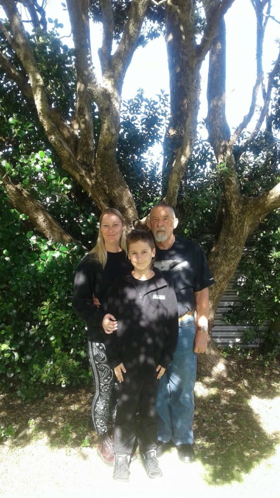
This week has been taken up with preparation for Alan’s mother Mary’s funeral. She passed away at 96 after a life well lived. In between all the preparation and time spent with family, I’ve been keeping my hands busy because it’s good for me to have downtime. As one of life’s true introverts, as much as I enjoy seeing family, I need time out.
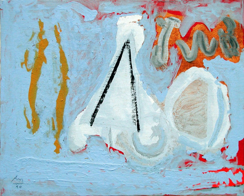
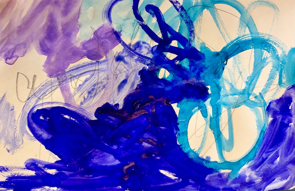
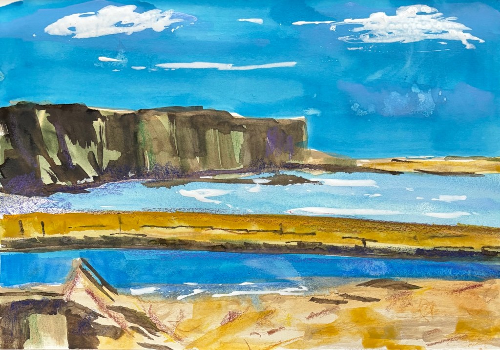
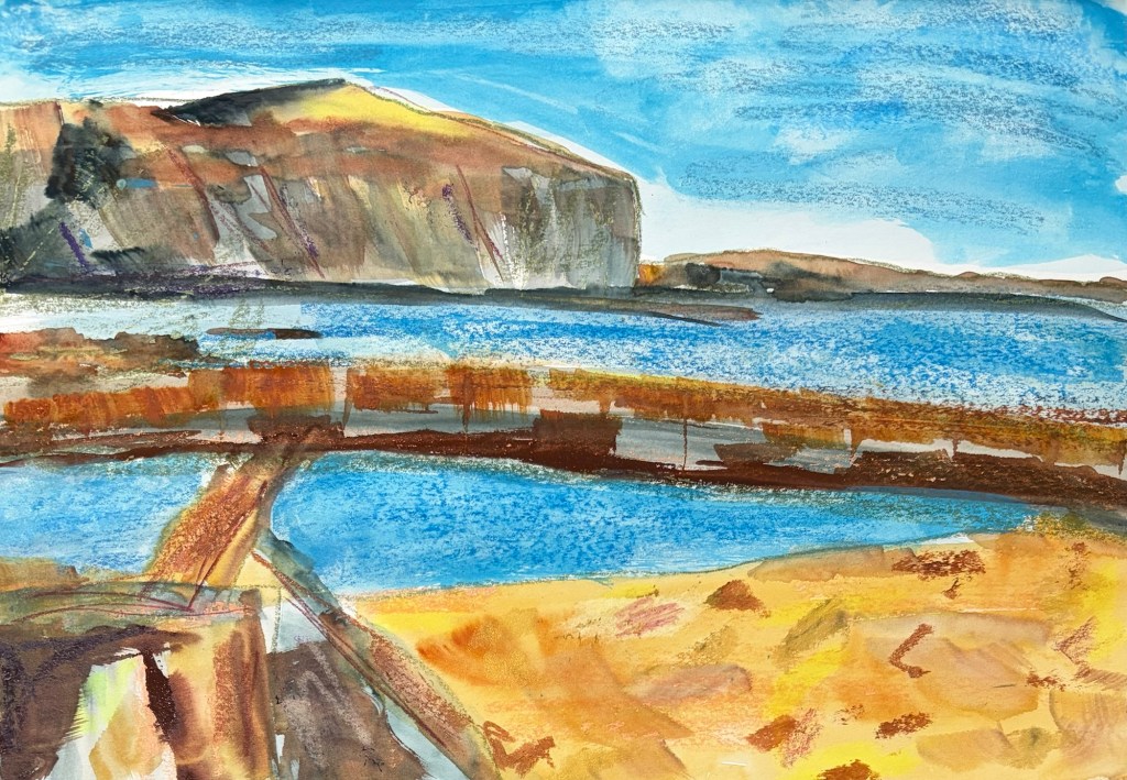
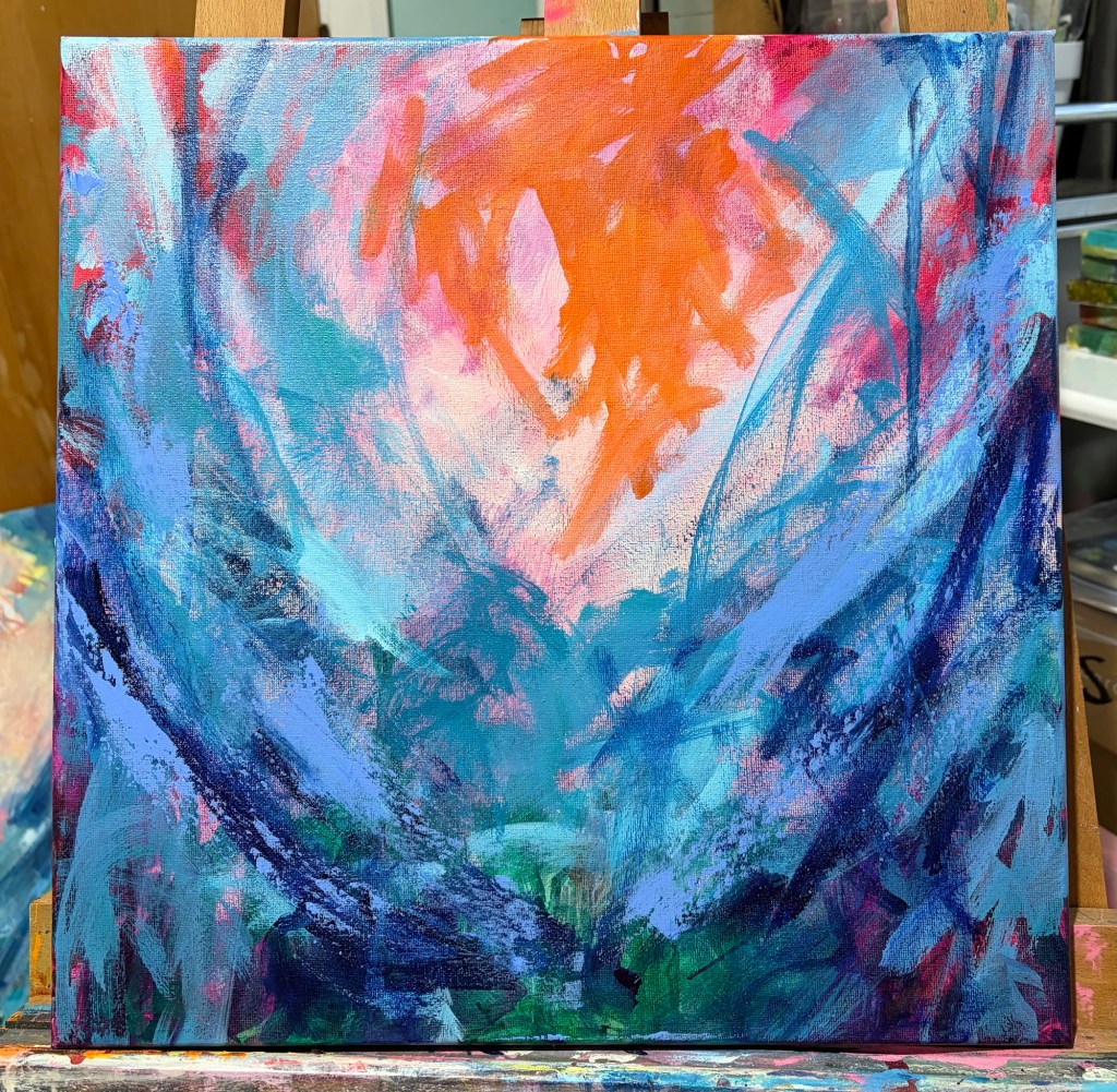
I’ve been experimenting with gouache. I got a few given to me last year, and bought a few at Christmas time. I love the vivid colors, they’re just beautiful. What I hadn’t appreciated is they re-wet, so it’s easy to end up with mud or pick up previous layers too. I’m not sure I’m going to enjoy them that much overall, despite the colors. I’ve been playing around with really loose mark making. I love Cy Twombly’s work for his expressive paint application and the fact he includes loose handwriting. I’ve been re-reading a book about his work, and I can see his influence in what I’ve been doing this week.